I first put together a version of this in fall 2019, wasn’t really happy with it, and didn’t share it. In early 2021, I came back to it and made some revisions, and I think it might be useful. Without further ado…
I’ve been poking around for good general-purpose, Arabic-script web fonts to use for a few projects. One obvious place to look is Google Fonts. So I went to their site and selected Arabic. Ok, wow… that narrows things down from 1,000+ fonts to 21. (Update: This number continues to grow, albeit gradually.) It shouldn’t be too difficult to determine which of those might work for my purposes.
And what are my purposes/requirements? Again, I’m looking for a general-use font, which would be suitable for entire paragraphs of text. Anything overly stylized or clearly intended for “display” is not going to work. With this criterion, I can eliminate the following 11 options at the outset: Almarai, Cairo, Changa, El Messiri, Jomhuria, Kufam, Lalezar, Lemonada, Rakkas, Reem Kufi, and Vibes (wtf?). Some of these are quite attractive typefaces in their own way—I would highlight El Messiri, Lalezar, and Reem Kufi—but they don’t fit my current use case.
So we’re already down to ten. A few more can be cut for particular reasons. Mada doesn’t look quite right to me. The letters join with little gaps (intentionally), which are reminiscent of a rendering problem. Harmattan was designed for West African languages, and thus fills an important niche. Finally, there’s Katibeh, which has certain embellishments — referred to in the description as “small serif-like outstrokes” — which seem to me to create an unwelcome distraction. As always, de gustibus non est disputandum.
This leaves us with seven options. Two of them, Aref Ruqaa and Tajawal, could have been excluded on stylistic grounds. But I wanted to give a chance to a couple of less conventional fonts, and these look nice to me.
Our seven finalists are as follows (in alphabetical order): Amiri, Aref Ruqaa, Lateef, Markazi Text, Mirza, Scheherazade, and Tajawal.
Now let’s introduce some further desiderata. I need a font that works in both Arabic and Persian. (This usually is not a problem. Persian has a few extra letters that are close variants of Arabic forms.) Light to moderate use of diacritics should not break anything. (This often is a problem.) And I’m looking for versatility and readability. The typeface should be elegant, without drawing too much attention, across different kinds of text.
For testing purposes, we can load the seven fonts, fill some boxes with sample text in Arabic and Persian, and set up a selector to compare the appearance of that text from one font to another. We ought to have a sense of what our alternatives might be, so the samples will initially be displayed in a browser/system default font (“serif”; this would be the worst case). There is a further option to try the “native stack” used in Bootstrap. (My guess is that other popular CSS frameworks take similar approaches.) I’ll follow up below with my conclusions.
Why am I doing this, by the way? Apart from wanting to identify fonts suitable for use in my work, I think that improvement in the general condition of Arabic-script typography on the web (as well as on our devices) will require knowledgeable users to give a damn. The current status quo is unrecognizably better than what I saw ten or fifteen years ago, but there’s still work to be done.
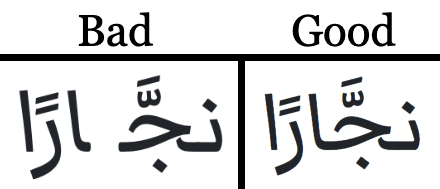
Quintessential Arabic ligatures (see the notes):
بسم الله الرحمن الرحيم
الحمد لله رب العالمين
A paragraph of Arabic prose, with light use of diacritics (source):
قال كليلة: زعموا أنَّ قردًا رأى نجَّارًا يشقُّ خشبة على وتدين راكبًا عليها كالأسوار على الفرس، وكُلَّما شقَّ منها ذراعًا أدخل فيها وتدًا، وأنَّ النجَّار قام لبعض شأنه، فانطلق القرد يتكلَّف من ذلك ما ليس من صناعته، فركب الخشبة ووجهه قِبَل ذلك الوتد، وتدلَّت خُصيتاه في الشقِّ، فلمَّا نزع الوتد انضمَّت الخشبة على خُصيتيه، فخرَّ مغشيًّا عليه، وجاء النجَّار فكان ما لقي منه من الضرب أشدَّ ممَّا مرَّ به أضعافًا كثيرة.
A paragraph of Persian prose (source):
مالداری را شنیدم که به بخل چنان معروف بود که حاتم طایی در کرم. ظاهر حالش به نعمت دنیا آراسته و خست نفس جبلی در وی همچنان متمکن تا به جایی که نانی به جانی از دست ندادی و گربهٔ بوهریره را به لقمهای ننواختی و سگ اصحاب الکهف را استخوانی نینداختی. فیالجمله خانهٔ او را کس ندیدی درگشاده و سفرهٔ او را سرگشاده. شنیدم که به دریای مغرب اندر راه مصر برگرفته بود و خیال فرعونی در سر «حَتَّىٰ إِذَا أَدْرَکَهُ الْغَرَقُ» بادی مخالف کشتی برآمد.
A few lines of Arabic poetry, with moderate use of diacritics (source):
لا تَبْكِ ليلى ولا تطْرَبْ إلى هندِ
واشْرَبْ على الوَرْدِ من حمراءَ كالوَرْدِ
كأسًا إذا انحدَرَتْ في حلْقِ شاربِها
أجْدَتْهُ حُمْرَتَها في العينِ والخدِّ
فالخَمرُ ياقوتةٌ والكأسُ لُؤْلُؤةٌ
من كَفِّ جارِيَةٍ مَمشوقَةِ القَدِّ
A few lines of Persian poetry (source):
تا نسوزد عود در مجمر ندارد آدمی
تا نگرید آب در گوهر ندارد آدمی
تا نپیچد سر ز دنیا سر ندارد آدمی
تا نریزد برگ از خود بر ندارد آدمی
تا نگردد استخوانش توتیا از بار درد
جانِ روشنْ دیدهٔ انور ندارد آدمی
A few verses from the Qur’an, with heavy use of diacritics (source):
قَالَتْ إِنِّي أَعُوذُ بِالرَّحْمَٰنِ مِنْكَ إِنْ كُنْتَ تَقِيًّا قَالَ إِنَّمَا أَنَا رَسُولُ رَبِّكِ لِأَهَبَ لَكِ غُلَامًا زَكِيًّا قَالَتْ أَنَّىٰ يَكُونُ لِي غُلَامٌ وَلَمْ يَمْسَسْنِي بَشَرٌ وَلَمْ أَكُ بَغِيًّا قَالَ كَذَٰلِكِ قَالَ رَبُّكِ هُوَ عَلَيَّ هَيِّنٌ وَلِنَجْعَلَهُ آيَةً لِّلنَّاسِ وَرَحْمَةً مِّنَّا وَكَانَ أَمْرًا مَّقْضِيًّا
Tl;dr: None of these fonts is bad. (The less desirable ones were excluded already.) Some did better than others. I would say that Lateef, Markazi Text, Mirza, and Scheherazade basically passed all of the tests. (Update: See below for discussion of odd behavior in Markazi Text.) While I have comments on each of those four, they passed. Amiri is stylistically superior, but it has frustrating problems with diacritic placement. Aref Ruqaa can’t overcome the limitations of a handwriting font — though I don’t fault the designer. It’s nice for what it is. Tajawal is surprisingly delightful, but it shits the bed whenever a Persian letter occurs. (Come on; this would be so easy to fix!) After years in the top spot, Scheherazade is still probably my favorite. But Markazi Text is, on a technical level, the most impressive Arabic-script web font that I’ve encountered. Assuming you like the style, you could use it just about anywhere.
Now let’s comment on the candidates one at a time…
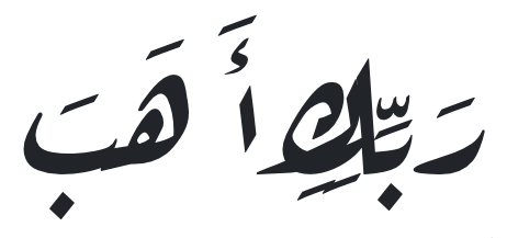
Amiri: This is, of course, a beautiful typeface, and I have a lot of respect for the developers behind the project. It’s an open-source and (if I’m not mistaken) ongoing effort. What I like most about Amiri is the versatility that it has by virtue of its timeless design. As for the version available through Google Fonts — last updated in April 2020 — there are a few rough edges. The biggest problem is in the placement of diacritics. They seem to be set at the same height relative to the line, regardless of the letter to which they’re attached. In effect, the designers have made sure that all diacritics go high or low enough not to collide with any letter forms. This leads to two problems. First, it looks odd when a diacritic is floating in space, far from the associated letter. (See, for example, the final hemistich in our snippet of Persian poetry.) Second, and perhaps more seriously, diacritics can bump into text in the previous or (less often) the subsequent line. One kind of collision has been avoided at the cost of another. There are ways of dealing with this. The letter forms could be made smaller overall, relative to line height, in order to leave more empty vertical space. (With Scheherazade and Lateef, this approach is taken to an extreme.) In more modern Arabic type designs, you’ll usually see that the variation in letter height is reduced; namely, tall letters like alif and lām don’t extend too much higher than the short letters. This makes life easier. It probably isn’t an option for Amiri, given the historical inspiration, but who knows — just a touch of vertical compression might make a difference. What would seem to be the key optimization, however, would be to get diacritics closer to the letters. (See Markazi Text for a good example of this.)
Aref Ruqaa: What can I say? I found this typeface æsthetically pleasing when I first saw it, and I still do. It proved somewhat more resilient than I expected. But at the end of the day, this is a kind of handwriting font, and there are going to be places where its logic is outfoxed and it produces strange, unnatural orthography. The worst problems occur where certain letters (sīn and shīn are big offenders) are found in long connected segments. These strings of letters are set to start from above and slope downward, ending at line level. It can be a nice effect, and reminiscent of real handwriting, when just a few letters are involved. But certain combinations lead to bizarre results. (See, for example, the third verse of four in the passage from the Qur’an.) If you’ve ever tried a nasta‘līq typeface, this issue will be familiar to you. Anyway, I’m sure that Aref Ruqaa has its place, and I’d like to see further development in Arabic-script handwriting fonts.
Lateef: This is an old standby from SIL. I always viewed it as the similar but slightly inferior cousin of Scheherazade. (See also my comments on the latter.) The stroke is heavier. My understanding is that it doesn’t have as many glyphs. (What’s with the empty circle in place of the standard marker for the end of a qur’anic verse?) You know, Lateef is fine; I just don’t use it.
Markazi Text: This is a newer font — a
variable font, at that! — from Borna Izadpanah. I could say a lot about it, but I’ll
limit myself here to four points. First, Markazi Text is well designed. It does
everything you could reasonably ask of it, and then some. Second, make sure that you
set the HTML lang attribute to "ar" wherever you use this
font. Otherwise you might encounter problems with diacritics. (In particular, I saw
that adding a shaddah plus a short vowel to a letter — not an
uncommon scenario — resulted in a
break in continuity.) Markazi Text is the
only font I tested that has such sensitivity to the lang attribute, and
I don’t know why. (Update 1: Even with correct settings, I see
weird behavior involving diacritics in Safari. Now I worry there’s something amiss
with the font. Update 2: As of late 2021, it seems the issue is
fixed in Safari. It’s great to see this much progress!) Third, the style may not be
for everyone. I think it’s a bit unpleasant how the final tooth of sīn or
shīn reverses the slant so decisively (and only in the initial or medial
position?). But artists have license, no one is forcing me to use this, I should
make my own font if I’m so bothered by it, yada yada. Fourth… actually, I can’t
remember what my last point was supposed to be. Maybe it’ll come back to me. The
bottom line is that Markazi Text is a good general-purpose typeface. Setting aside
the finicky behavior around combined diacritics, it holds no bad surprises that I’ve
seen.
Mirza: I like this font well enough. The proportions are correct, and it has some nice ligatures. It’s worth noting that those ligatures appear in Chrome and Firefox, but not in Safari. So the distinctiveness of the typeface will be lessened for users of iOS devices. This is puzzling to me, since Amiri includes some of the same ligatures, and it’s more consistent across all three browsers. (Update: This seems to have been fixed. I don’t know if the problem was with Safari or Mirza, but it’s gone now.) Anyway, Mirza has other stylistic idiosyncracies that should be taken into consideration. I’m not a big fan of the stubby comma. Diacritic placement is handled in an interesting way. They’re set close to the letters, and they’re so small! Shrinking the diacritics is one way of preventing collisions. I think they could be a bit difficult to make out. On an esoteric note, the common practice in Arabic script, when a kasrah and a shaddah are added to the same letter, is to move the kasrah above the letter (directly below the shaddah). Mirza instead leaves the kasrah beneath the letter regardless of context. I hesitate to call this wrong, but it’s unusual. (Update: I later noticed that Markazi Text displays the same behavior.) It’s possible I’ll use this typeface at some point. It didn’t break in any of the tests.
Scheherazade: This has been my Arabic-script font of choice for years, both on and off the web. It isn’t perfect, but it’s close, and I keep returning to it. One thing to be aware of is that Scheherazade always comes out looking smaller, with more space between lines of text, relative to other typefaces at the same “size.” (This also applies to Lateef.) The generous built-in spacing allows the font to maintain traditional proportions and accommodate diacritics without many problems. Now, I don’t always need this buffer. Sometimes I find myself both increasing the size and decreasing the line height/spacing where I use Scheherazade. But I like that it errs on the side of safety.
Tajawal: Somehow I find this appealing! The style is quite
modern — far from the naskh derivatives that I generally
prefer. I don’t think I could go through with using this for longer blocks of text.
It looks cool, though, and it handles diacritics surprisingly well. The biggest
problem here is the lack of support for Persian letters. Even the Persian
yā’ (U+06CC)
breaks
this font, which is unnecessary, since it should be identical to the Arabic
yā’ in the initial or medial position, and identical to the Arabic
alif maqṣūrah in the final or isolated position. So the glyphs already
exist. To include pe, che, and zhe would mean adding
dots; kāf and gāf would require a bit more effort. The situation
doesn’t need to be as bad as it is currently.
Now for a few final notes…
Divine ligatures: Two of the most characteristic ligatures in Arabic are for Allāh and lillāh (the latter meaning “unto God”). Many fonts, in many text processors — including modern browsers — will automatically produce the Allāh ligature if the letters alif, lām, lām, hā’ appear followed by a space. A smaller number of fonts go a step further, generating a ligature for lillāh as well. (The only difference in spelling between the two words is the initial alif in Allāh. The ligatures also tend to be identical except for the separate first letter, in which case applying the lillāh ligature is as good as applying both.) And some fonts have neither. I try not to get too fussed about this, since there are advantages and disadvantages to each approach, but we may as well test it. As can be seen above, among our seven fonts, Amiri is the only one that makes both ligatures automatically. Markazi Text and Tajawal modify Allāh, but not lillāh. (This is currently my preference.) The others — Aref Ruqaa, Lateef, Mirza, and Scheherazade — produce neither ligature. It’s not a hill worth dying on.
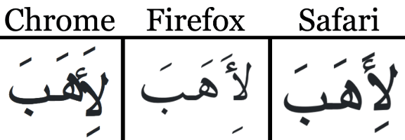
Browser differences: I checked everything in current macOS versions of Chrome, Firefox, and Safari. In Chrome, the default “serif” font performs unusually badly when diacritics are introduced. YMMV. (Update: This seems to have been fixed. It’s nice to revisit these points, just a year later, and see little improvements!) Once I switch to any of the dedicated Arabic-script fonts in Chrome, it’s smooth sailing. Firefox is even better. Not only do the Google Fonts work properly, but Firefox provides a nice default typeface that looks almost like a derivative of Scheherazade with added ligatures (and less-than-ideal diacritic placement). Kudos to whoever set that up! Safari is perhaps the weakest performer. It doesn’t act up too badly with the default font, but I saw problems with diacritic use in both Aref Ruqaa and Markazi Text. And there are disabled (?) ligatures in Mirza. (Update: All of these issues seem to have been fixed, at least to some extent.) What I can say, in any case, is that relying on a fallback font for Arabic or Persian is risky.
Bootstrap fonts: Honestly, I’ve found that a well-thought-out “native stack” appears to be a workable option for Arabic-script languages. It may not be beautiful, but it won’t be broken, either. The Bootstrap default setting has not turned out badly in any browser, on any device that I’ve tested. Is this burying the lede? Is there any point in loading a web font? For me, the answer is still yes; I want something a bit nicer. But for a project where the goal is to support Arabic and Persian text, without prioritizing it, I don’t think this would be called for. As we all know, the practice of relying on widely available native fonts has clear advantages.
Open season: Did I overlook something or make a mistake? If so, please let me know. Also, if you’d like to adapt these tests to your own nefarious ends, feel free. The files are available on GitHub.
Made with coffee and pedantry by
Theo Beers
Last updated Dec. 2021